Information Boards

Komal, Hyderabad, India

The information boards should be understood by the user.
Bad Designs

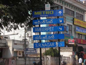
This particular board shows the direction to different parts of the city in two languages  which is appreciated . But the “METRO CASH AND CARRY” is not understood by the user.When design is not understood it is a bad design.
Bad Designs

2008 - 12.02.
These icons link to social bookmarking sites where readers can share and discover new web pages.

12345
0 rating from 0 votes


(optional field)
(optional field)

Comment moderation is enabled on this site. This means that your comment will not be visible until it has been approved by an editor.

Remember personal info?
Small print: All html tags except <b> and <i> will be removed from your comment. You can make links by just typing the url or mail-address.

« Qaman/Temple As A Street Furnit…Speed Limit Boards »

See main page for Boycott Bad Design 08 category ≡ Go back to UMO Homepage