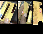
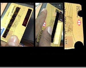
ATM Card
Abhishek Tongia,Pune

An inscribed or cut-away space for Thumb and Finger suggested in the picture can be a better solution to overcome this bad design.

|
|
Tweet |


|
|
Tweet |
1114 | Posted In: Boycott Bad Design 07 | One comment | 761 views |


« Road Crosssing ≡ Battery indication »
See main page for Boycott Bad Design 07 category ≡ Go back to UMO Homepage
Bad Design Showcase
International Cartoon Showcase
All Bad Designs
All International Cartoons
1. (8180) New Ladies Jeans Design
2. (8103) Bike Choke in Hero Honda
3. (6391) Difficulty in cleaning the lid
4. (6227) Nail Cutter
5. (5891) There is nothing to hold
6. (5264) Mumbai Taxies
7. (4688) Usha Lexus Mixer Grinder Lid
8. (4537) Tuhin Paul, India
9. (4141) Care should be taken to use sta…
10. (4106) People carry heavy luggage
1. [9] (1) Mahmoud Sanati, Iran
2. [5] (9) Abani Kumar Rath,India
3. [5] (7) Senad Nadarevic, Cazin
4. [5] (6) Marcin Bondarowicz - Poland
5. [5] (6) Senad Nadarevic, Cazin
6. [5] (3) Michael Mayevsky ,Ukraine
7. [5] (3) Michael Mayevsky ,Ukraine
8. [5] (3) Michael Mayevsky ,Ukraine
9. [5] (3) Valluri Krishna Kishore, India
10. [5] (3) Miroslav Bozhkov, Bulgaria
Abhijit: Wah! What an observation! Shabash!!!
sanjeev: Dear sir,
can you tell me any service centre of USHA LEXUS JUICER, in phagwara, Punjab
Passerby: I'm right-handed and I like this. To me it's pretty good pen for the cursive, ball equivale…
taylormade r11 dr…: most people Wilson Tennis Racket are not stupid to grow up to ten
prabir Banerjee: Prabir banerjee on 03-04-12 said:
i want to know the service center of usha lexus mixer cu…
TAFE: Good for you! Akin to the Razzies. By the way how come we never win any Razzie?
L10N-Bridge: and when travelling, you need to have special power adapters with you, too -> redesign for …
Vivekanand Raula: Hi Venkat, good catch. I wish you all the very best.
pijush choudhury: i want to know the service center of usha lexus mixer cum jucer in asansol& kolkatta.My mix…
saikrishna: its good
Supported by uiser and auroh
© Copyright 2001-2015, UsabilityMatters.Org- Creative Commons : Some rights reserved. |
Entries (RSS) and Comments (RSS).

This ATM Card design is the best, i feel because this actually speaks about all those fields where such punching cards are used. Like Phonebooths, Attendance in Offices, Railway Metro Passes (Abroad) etc. Good thought.